

In the world of kitchen design, trends may come and go with the seasons: matte black faucets today, terracotta everything tomorrow, but color choices have a way of leaving a lasting mark. That’s why the most successful kitchen designs don’t chase what’s in vogue. Instead, they lean into palettes that feel grounded, effortless, and enduring.
Timeless colors create a visual calm, allow your personal style to evolve over time, and blend easily with a range of materials, from stone countertops to warm woods and polished metals. Whether you’re designing your kitchen from the ground up or simply thinking about a fresh coat of paint, these classic colors have stood the test of time—and with good reason.
Here are six kitchen colors that remain perennially stylish, along with ideas for how to incorporate them with elegance and intention.
1- Crisp White: The Eternal Foundation
If any color defines the word “timeless,” it’s white. Pristine and adaptable, a white kitchen never feels out of place, whether in a coastal cottage or a modern city apartment. It reflects light beautifully, expands small spaces, and allows other design elements to shine.
How to Use It:
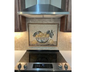
White cabinetry is a natural starting point, often acting as the visual anchor of the space. For added warmth, combine white with wood flooring, cane or rattan accents, or brass hardware. Pair with marble countertops and a subtle off-white backsplash to create layers of softness.
White also plays well with textural variation. Consider a mosaic tile backsplash in muted white or cream to introduce depth without breaking the neutral flow. This is an ideal way to keep an all-white kitchen feeling tactile and sophisticated, rather than flat.
2- Soft Gray: Understated Elegance
Gray brings a whisper of color while maintaining the neutrality that makes white so versatile. Pale dove gray can feel almost ethereal, while deeper slate tones offer drama and contrast.
How to Use It:
Use gray cabinetry to balance both warm and cool materials: stainless steel, marble, and even warmer woods all pair beautifully. In open-concept homes, gray kitchens feel seamless and modern without overwhelming adjoining living spaces.
Avoid going too flat or sterile by incorporating mixed materials: soapstone countertops, brushed nickel fixtures, or matte ceramic tiles can add the necessary texture and balance.

3- Navy Blue: Depth and Drama
Deep and rich, navy blue is a perennial favorite among designers for its ability to feel both classic and contemporary. It’s the color equivalent of a well-tailored blazer: reliable, polished, and never overdone.
How to Use It:
Navy is especially impactful when used on lower cabinetry or kitchen islands, paired with crisp white uppers and marble or quartz countertops. It provides just enough drama while still feeling grounded.
Add in warm metallics—think brass light fixtures or copper cookware—for a slightly nautical, slightly Parisian look. If you’re hesitant to commit to an all-over navy scheme, even just painting a pantry door or shelving unit in navy can deliver a sophisticated punch.
4- Earthy Green: Nature’s Answer to Neutral
While green may seem trendy in its more saturated forms, its earthier tones—sage, olive, moss—have a timeless quality drawn from nature itself. These muted greens bring a sense of serenity and connection to the outdoors, making them an ideal choice for the heart of the home.
How to Use It:
Cabinetry in sage or olive green pairs beautifully with warm wood floors and natural stone countertops. Unlike cooler shades, these greens play well with organic materials and vintage details, making them a natural fit for farmhouse or transitional kitchens.
For a layered look, consider introducing green through open shelving, window frames, or even a painted ceiling. A carefully chosen green backsplash, like zellige tile or a mosaic artwork with hints of forest and fern, can add dimension without overwhelming the space.
5- Warm Beige and Greige: Quiet Luxury
In recent years, beige and its cooler cousin greige (a mix of gray and beige) have made a strong comeback, and not just as a counterpoint to minimalism. These warm neutrals feel inviting and elevated, evoking European kitchens where timelessness and comfort go hand in hand.
How to Use It:
Beige or greige cabinets are ideal for those who want a soft, organic backdrop with room to layer in richer tones. Pair with natural stone countertops, unlacquered brass hardware, and linen Roman shades for a lived-in yet luxurious effect.
These hues are especially effective in kitchens with open shelving or glass-front cabinetry, where the subtle undertones of beige can enhance rather than compete with curated dishware or vintage finds.
6- Black: Bold and Enduring
Though black might not be the first color that comes to mind when thinking “timeless,” its enduring appeal lies in its strength and versatility. Done right, black adds a dramatic edge while maintaining a classic silhouette.
How to Use It:
Use black as an accent or a base: matte black cabinets with gold hardware feel modern yet classic, while black-painted window frames or light fixtures can ground an otherwise light space. Black stone countertops or backsplash tile can add sophistication and contrast, especially in white or beige kitchens.
Keep the look from skewing too heavy by mixing in warm wood, plenty of natural light, and light-colored flooring or walls. The result? A balanced, architectural kitchen with serious staying power.